Web App Design System
The design system of the product (apps/web): tokens in src/app/globals.css (Tailwind 4, CSS-first), primitives in src/components/ui/, and a cn() helper (twMerge(clsx(...))) in src/lib/utils.ts.
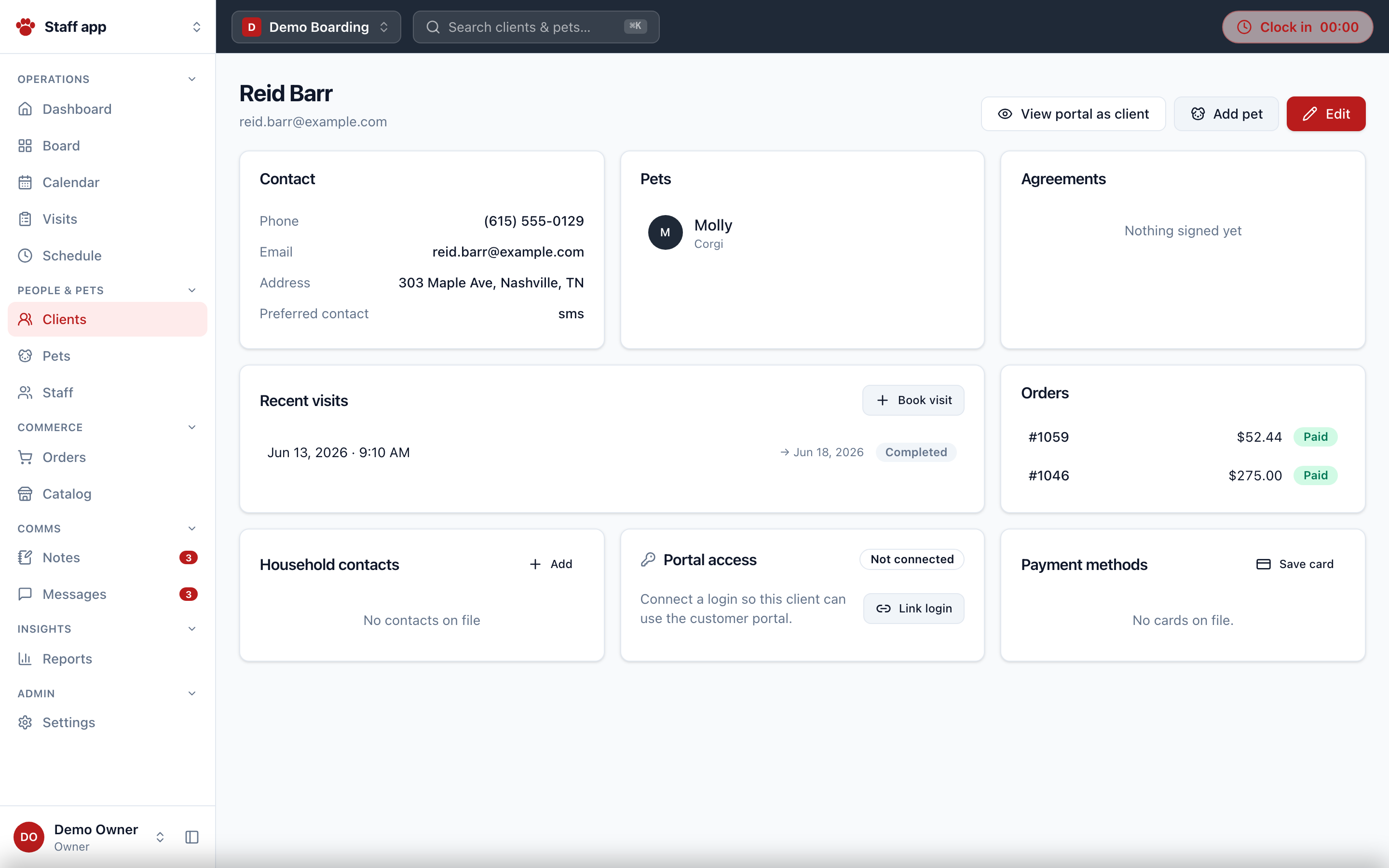
Tokens
Colors (CSS custom properties consumed as bg-* / text-* / border-*):
| Token | Value | Use |
|---|---|---|
brand | #b91c1c | primary actions, active nav, focus ring |
brand-soft | #fee2e2 | active-nav backgrounds, selection |
ink | #111827 | overlays (bg-ink/40) |
charcoal | #1f2937 | the app header, avatars |
background / foreground | #f8fafc / #0f172a | page |
card | #ffffff | surfaces |
muted / muted-foreground | #f1f5f9 / #64748b | fills, secondary text |
border / input | #e2e8f0 | strokes |
destructive | #dc2626 | dangerous actions |
success / success-soft | #047857 / #d1fae5 | positive status (e.g. clocked in) |
warning / warning-soft | #b45309 / #fef3c7 | attention status |
info / info-soft | #1d4ed8 / #dbeafe | informational status |
Radii: lg 0.625rem, md 0.5rem, sm 0.375rem. Font: system stack (ui-sans-serif, system-ui, …). ::selection uses brand-soft. Orgs can set an accentColor, surfaced in branding contexts (directory cards, portal).
Primitives (src/components/ui/)
Button (button.tsx, CVA)
Base: inline-flex items-center justify-center gap-2 whitespace-nowrap rounded-md text-sm font-medium transition-colors focus-visible:outline-2 focus-visible:outline-offset-2 focus-visible:outline-ring disabled:opacity-50 [&_svg]:size-4 cursor-pointer, default type="button".
Variants: default (brand), secondary, outline, ghost, destructive, success, link. Sizes: default h-9 px-4, sm h-8 px-3 text-xs, lg h-10 px-6, icon h-9 w-9.
Badge (badge.tsx, CVA)
inline-flex items-center gap-1 rounded-full px-2.5 py-0.5 text-xs font-semibold. Variants: default (muted), brand, success, warning, info, destructive, outline. Two domain-aware wrappers keep status rendering consistent everywhere:
VisitStatusBadge— planned=info, due_in=warning, in_house=success, overdue/no_show=destructive, completed/cancelled=default.PaymentStatusBadge— unpaid, authorized, deposit_due, deposit_met, paid, refund_due.
Card / Table / Inputs
- Card:
rounded-lg border bg-card shadow-sm; headerp-5 pb-3, contentp-5 pt-2. - Table: wrapped in
overflow-x-auto rounded-lg border bg-card shadow-sm; headerbg-muted/60; headsh-10 px-4 text-xs font-semibold uppercase tracking-wide text-muted-foreground; clickable rows usedata-clickable="true"+ rowonClick→router.push. - Input/Textarea/Select share
h-9 rounded-md border border-input bg-card px-3 text-sm shadow-xswith the brand focus outline.
misc.tsx — the utility belt
Avatar (initials fallback, charcoal), Separator, Skeleton (animate-pulse rounded-md bg-muted), EmptyState (dashed card + PawMark + hint/action), PawMark (inline SVG paw logo), PageHeader (text-2xl font-bold tracking-tight + sub + actions), Dialog (hand-rolled: bg-ink/40 overlay, max-w-lg / max-w-3xl wide, useModalFocus Tab trap + Esc + focus restore), Stat (text-3xl font-bold tabular-nums, tones brand/success/warning/destructive), Tabs (segmented bg-muted p-1 rounded-lg, active bg-card shadow-sm), Field (auto-wires label↔control ids), KV (label/value row).
route-status.tsx
NotFoundScreen, ForbiddenScreen, ErrorScreen, and authErrorCode(error) which decodes ConvexError({code}) → UNAUTHENTICATED | FORBIDDEN | ORG_NOT_FOUND (with message-substring fallback for prod redaction).
Recurring class idioms
- Section labels:
text-sm font-semibold uppercase tracking-wide text-muted-foreground - Money and durations: always
tabular-nums - Page grids:
grid gap-4 lg:grid-cols-3 - Standalone pages (platform, apply, our-customers, portal) reuse the charcoal header treatment.
Relationship to this console's design
The admin console uses a different, newer template ("Clinical" — see Admin Console Design): OKLCH tokens, dark mode, remapped blue accent ramp. The product's design system predates it; expect the product to migrate toward the Clinical conventions over time.