Admin Console Design System
This console (apps/admin) is built on the Clinical theme — a single-theme, token-first design system intended as the template for future internal tools. Everything below is implemented in src/app/globals.css and src/components/.
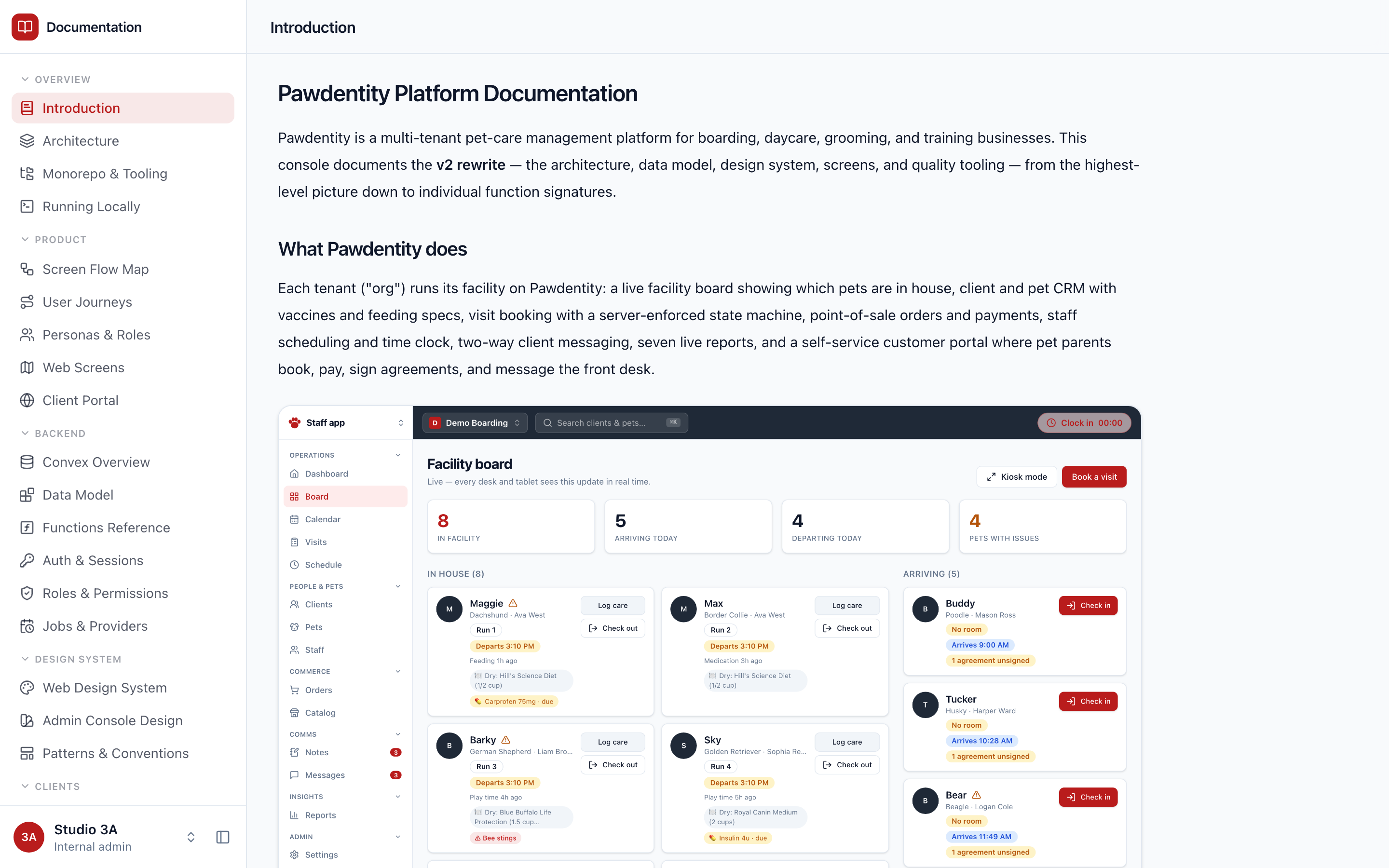
Principles
- One theme, two appearances. Clinical is the only theme; light/dark via a
.darkclass on<html>, applied before first paint by an inline script readinglocalStorage.theme(default: system preference). - The accent is a remapped ramp. Components always use Tailwind
blue-*classes (bg-blue-600,text-blue-700,bg-blue-600/10). The theme remaps the entire blue ramp (and mirrors it tosky-*/indigo-*) to the brand color#3a6ea5in OKLCH — so rebranding is a token edit, never a component edit. - Severity stays stock. Red/amber/green ramps are never remapped and never used raw for status text — status goes through Badge variants and the
--warning/--destructivetokens. - No fake data, ever. If a surface has no real data source, it renders
NotYetWiredBanner— never mock rows, mock KPIs, or placeholder charts.
Tokens
All tokens are CSS variables exposed to Tailwind via @theme inline (CSS-first, no tailwind.config.ts).
- Neutrals (light):
--background oklch(0.985 0 0),--foreground oklch(0.09 0 0),--cardpure white,--muted-foreground oklch(0.45 0 0),--border oklch(0.92 0 0),--sidebar oklch(0.97 0 0). - Neutrals (dark):
--background oklch(0.09 0 0),--card oklch(0.14 0 0),--sidebar oklch(0.07 0 0). - Accent: the blue ramp at hue 251.54 (brand
#3a6ea5≈blue-700 oklch(0.488 0.0953 251.54));--primary,--ring,--chart-1,--sidebar-primaryderive from it. Alert--destructive: #c4392c. - Radius scale: everything derives from
--radius: 0.75rem— sm ×0.6, md ×0.8, lg ×1, xl ×1.4, 2xl ×1.8, 3xl ×2.2. - Type: sans = Hanken Grotesk, mono = IBM Plex Mono (next/font). Base html 16px, body 15px/1.625; h1 2.25rem/700/−0.025em, h2 1.5rem/700, h3 1.125rem/600. Everything antialiased; checkbox/radio
accent-color: var(--primary).
Layout frame
AppFrame:flex h-screen min-h-0= sidebar +main.flex-1.min-w-0.overflow-y-auto. Onlymainscrolls; scroll resets on navigation.- Sidebar: default 256px, drag-resizable 200–480 (double-click resets), collapsible to a 56px icon rail; width/collapsed/section state persist to localStorage. Titlebar (h-14) holds the app switcher (blue icon chip + name; popover when multiple apps are registered). Nav sections have sticky uppercase headers with rotating chevrons; the active route's section is force-expanded. Active links:
bg-blue-600/10 text-blue-700+aria-current="page"; matching is longest-prefix-wins. Footer: account popover (identity, role pill, appearance toggle, sign out) + collapse button. - Page headers: no global topbar. Each page renders a sticky
PageHeader(h-14,bg-background/95 backdrop-blur) that auto-titles from the nav registry, with optional back link and actions slot. The h-14 intentionally aligns with the sidebar titlebar. - Content shell:
max-w-7xl mx-auto px-8 py-6 space-y-6, cards as the base surface; data-dense screens may go full-bleed. - App registry (
src/lib/apps.tsx) is the single source of truth: the sidebar, the/appslauncher, and page-header titles all derive from it.
Components
| Component | Contract |
|---|---|
| Card | rounded-xl border bg-card shadow-sm; header p-6 space-y-1.5, content p-6 pt-0 |
| Button (CVA) | variants default (foreground-on-background), destructive, outline, secondary, ghost, link, success (bg-blue-600); sizes h-9/h-8/h-10/icon; asChild via Radix Slot; focus ring-ring/50 ring-[3px] |
| Badge (CVA) | rounded-md px-2 py-0.5 text-xs font-medium; default, secondary, destructive, success (blue), warning, outline |
| Tabs | custom (not Radix), roving tabindex. underline: active -mb-px border-b-2 border-blue-600; pill: bg-muted p-1 rounded-lg, active bg-background shadow-sm. The active underline always renders, even with one tab. UnderlineTabs is URL-query-param-driven with count pills |
| StatTile | uppercase 12px label over text-2xl tabular-nums value; with onClick becomes a KPI-as-filter toggle (border-blue-600 bg-accent/30 active). StatTileRow keeps tiles to one measured row via ResizeObserver |
| Tables | bordered cards: overflow-hidden rounded-xl border bg-card + divide-y; numeric cells tabular-nums; header cells text-xs uppercase tracking-wide text-muted-foreground |
| Skeletons | rounded bg-muted bars in animate-pulse containers with aria-busy; shape-matched per layout and used in every route's loading.tsx so swaps don't reflow |
| Popovers | hand-rolled, portaled to <body> with fixed positioning; outside-pointer + Escape dismiss; shell rounded-lg border bg-popover shadow-lg p-1. No native <select> — SelectMenu / MultiSelect build on this pattern |
| NotYetWiredBanner | dashed rounded-lg border-dashed bg-muted/40 with a PlugZap icon — the mandated empty state for unwired surfaces |
| Docs viewer | /docs/[slug] renders markdown via react-markdown + remark-gfm with the console's typographic renderers |
The flow map
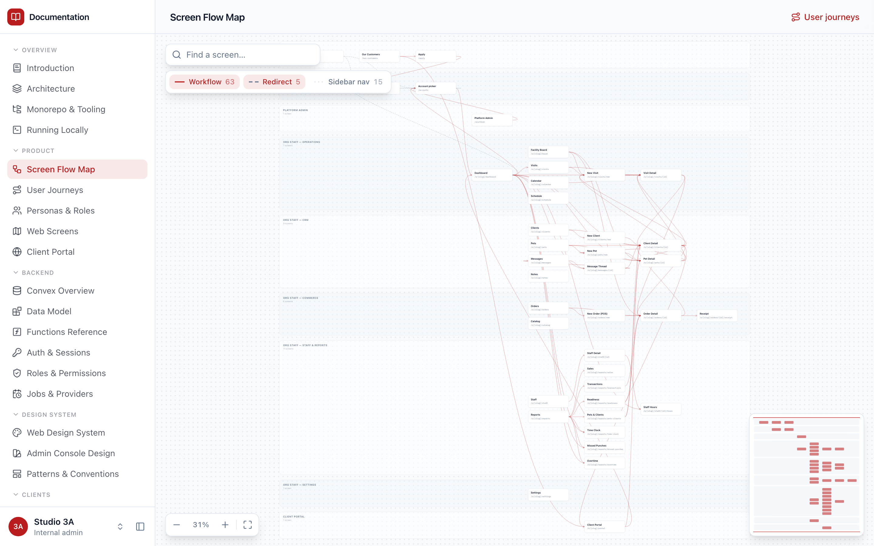
The Screen Flow Map is a custom SVG canvas (no diagram library): swim-lane bands, hand-positioned columns, cubic-bezier edges with per-kind styling (workflow / redirect / sidebar), wheel zoom toward cursor, drag pan, fit/100% controls, search, a minimap, and a selection panel listing inbound/outbound navigation. Its data (src/lib/flowData.ts) is derived from the product's actual route tree and navigation calls.
Docs diagrams
The documentation's own diagrams are theme-aware React SVG components (src/components/diagrams/), not images: boxes render HTML in foreignObject so text wraps and inherits tokens, which is why every diagram adapts to light and dark automatically. Markdown embeds one with a fenced code block whose language is diagram and whose body is the registry name (see diagrams/index.tsx). Screenshots in the docs live in public/screenshots/<theme>/<mode>/ and follow the console's live appearance the same way; they are captured from the running seeded app by node tools/assets/assets.mjs docs — re-run it whenever the product UI changes materially.